I don't normally "do" Halloween cards. Halloween doesn't scream "card sending occasion." But there are some super cute sets in the Stampin' Up! Holiday Mini Catalog and simply everyone in the stamping blog-o-sphere is doing Halloween themed cards and colors. And I don't like to be left out.
The "Mingle All The Way" stamp set has stamps for all the Fall and Winter holidays: Halloween, Thanksgiving, Christmas, and New Years. I thought the Halloween stamp from this set would be perfect for this week's Paper Craft Crew Challenge Sketch.
I knew I had a piece of striped Tangerine Tango DSP from the "Flowerpot" pack hanging around and another sheet of large white dots on Blackberry Bliss DSP from the "Sweet Taffy" pack. I used my Blackberry Bliss, Tangelo Tango, and Basic Black Stampin' Write Markers to color directly onto the stamp. Then I huffed on it to re-wet it and stamped the image onto a piece of Whisper White card stock. At first I wasn't too pleased with the sketchy image, but then I decided it was "ghostly" and "Halloweeny" and was perfect!
I added a couple of stickers from the September Paper Pumpkin kit (there were a bajillion in that kit!!) and a piece of Tangelo Tango ribbon and a little strip of Crushed Curry DSP that was the back of the Tangerine Tango piece for a little accent.
Tuesday, September 30, 2014
Monday, September 29, 2014
Christmas in September (part three)
I'm so lucky to have an amazingly creative BFF who loves to stamp--and has taught me so much about stamping! For my Christmas card-making class on Saturday, the amazingly creative, Lynn Birus, designed this card. It's awesome!!
Lynn used Versamark on the embossed background to give some depth and interest. I love the little details in her design: the White Chalk Marker on the berries, the Mossy Meadow line on the holly leaves, and, of course, the coloring with the markers. So pretty. She's a design genius!!
Friday, September 26, 2014
Celestial Stars
When I saw this week's Fab Friday sketch challenge I knew I wanted to use the constellation DSP from the Maritime pack. I really like this sheet--it stands out from the other "cutesy" sheets in the pack that coordinate with the "Sea Street" stamp set. I like that there are options in all of Stampin' Up's designer series papers.
Here's the Fab Friday sketch.
And here's my card. I searched and searched my piles (and piles) of DSP for some silver glimmer paper, but couldn't find any. But the red glimmer paper for the star works just as well...if not better.
Here's the Fab Friday sketch.
And here's my card. I searched and searched my piles (and piles) of DSP for some silver glimmer paper, but couldn't find any. But the red glimmer paper for the star works just as well...if not better.
Thursday, September 25, 2014
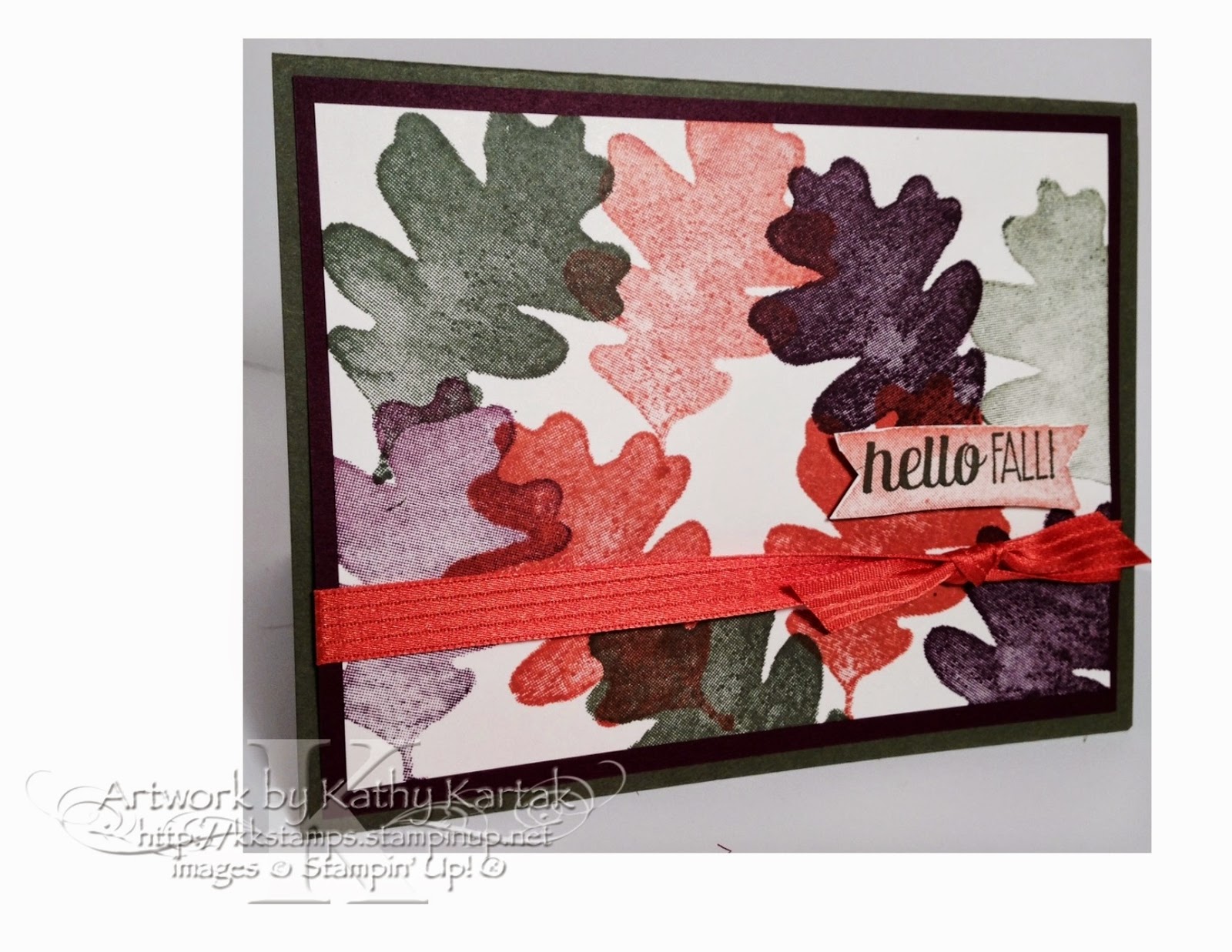
Hello Fall!
Fall is one of my favorite times of the year! I love the crisp air and the changing leaves. (I also love snow, but let's not get ahead of ourselves!)
When I saw the "For All Things" stamp set in the Holiday mini, I knew it would become one of my favorites. I had to pace myself, though. I could have started using it in July, but I didn't want to rush the season. Now that's it's well and good into the fall season, I can bring out this stamp set. I love the watercolor feel to the stamps.
This week's Nacho Average Challenge is to use three of the newest in colors and these are perfect for a fall card!
My card is quick and easy, and kinda pretty, if I do say so myself (and I do). I stamped some of the leaves in full strength and some were stamped off once.
(Stamp Set: For All Things; Inks: Blackberry Bliss, Tangelo Twist, Mossy Meadow; Card Stock: Mossy Meadow, Blackberry Bliss, Very Vanilla; Accessory: Tangelo Tango Stitched Satin Ribbon) |
Wednesday, September 24, 2014
Masculine Fall Birthday
I'm playing along with The Paper Players challenge blog for the first time! This week's challenge is to make a clean and simple masculine birthday card.
I grabbed the oldest-but-still-current stamp set that I own: "Lovely As A Tree." I stamped the image in Old Olive onto Very Vanilla and layered it onto Cajun Craze and Old Olive. I had a piece of "Color Me Autumn" DSP right at hand and thought a strip would give just a pop of autumn color. I was going to add the sentiment directly onto the Hello Honey card base, but I as I was getting ready to stamp it, I thought it would be better on a little banner--so I added that. I like the way all the elements go together, but the card stayed clean and simple.
Tuesday, September 23, 2014
Christmas in September (part deux)
When Stampin' Up debuted the "Wondrous Wreath" stamp set and matching framelits at the #InspireCreateShare2014, we were all wowed! The stamp set is adorable, of course, but they've added guides to the stamps AND the matching "Wonderful Wreath" framelits, so that you can line them up perfectly as you stamp the layers and then cut out the images. The stamps are photopolymer and you can see right through them. Awesome!
You can get the "Wondrous Wreath" PLUS "Wonderful Wreath" framelits in a bundle and save 15% (137624 $43.25)!
This card also uses a sentiment from the "Watercolor Winter Too" set, which I curved. I LOVE that the photopolymer sets are malleable like that. And the border on the bottom is from the "Mosaic Madness" set.
I CASEd this card by Sharon Cheng--including the curved sentiment. Thanks for the inspiration Sharon!
(Stamp Sets:: Wondrous Wreath, Watercolor Winter Too, Mosaic Madness; Inks: Wild Wasabi, Garden Green, Real Red; Card Stock: Naturals, Real Red, Very Vanilla; Accessories: Wonderful Wreath Framelits) |
Monday, September 22, 2014
Christmas in September (Part One)
Coming up on Saturday is the second session of my Christmas card-making class. I'm designing two cards and my BFF, Lynn Birus, has designed the third card. Today I'm sharing the first of my designs with you.
My design is CASED from a card I got at the #InspireCreateShare2014 Stampin' Up convention. It was made by Elisa Breckinridge. Here's Elisa's card:
For my holiday card, I used the gorgeous "All Is Calm" Specialty DSP which makes a non-traditionally colored holiday card. The sentiment is from the exclusive hostess set "Good Greetings" that is only available until October 31st with a $300 workshop (or individual order). This set is so versatile! Contact me to schedule a workshop! [I don't know why this picture is turning out with a pink tinge.]
Sunday, September 21, 2014
Creation Station: Harvest Party
Welcome to another session of Creation Station! This time our theme is "Harvest Party" and we're featuring the set "For All Things" from the Holiday catalog.
My first project is a Thanksgiving invitation. I used the beautiful "Color Me Autumn" DSP for the wrapper. The invitation is closed with a length of 7/8" Natural Cotton Ribbon.
I made a dangly tag using the "Good Greeting" hostess set. I tied the tag onto the ribbon with Gold Baker's Twine--and I unraveled the gold so the tendrils would stick out.
Inside the invitation, I used the "Holiday Invitation" set also from the Holiday catalog. Here's how I was able to line up the 3 individual photopolymer stamps onto one block.
After I stamped the invitation, I cut it using the Oval Accent Bigz Clear die and mounted it on Cajun Craze and Old Olive card stock.
(Stamp Set: Holiday Invitation; Inks: Soft Suede, Cajun Craze; Card Stock: Crushed Curry, Cajun Craze, Very Vanilla; DSP: Color Me Autumn; Accessories: Oval Accent Bigz Clear Die) |
Next up, is the table setting, using the same "Color Me Autumn" DSP and 7/8" Natural Cotton Ribbon. On the front, I used one of the cards from the "Seasonal Snapshot Project Life Card Collection," mounted on Cajun Craze and Old Olive card stock.
(Card Stock: Cajun Craze, Old Olive; DSP: Color Me Autumn; Seasonal Snapshot Project Life Card Collection; Accessory: 7/8" Natural Cotton Ribbon) |
Finally, I made a Thanksgiving treat bag. I filled a 4" by 6" cellophane bag with autumn colored M&Ms and tied it with a length of Calypso Coral Seam Binding and added a bit of Gold Sequin Trim. The tag is made with the Scalloped Tag Topper Punch and stamped in Calypso Coral and Old Olive (stamped off once) ink.
You can follow the blog hop all the way around by using the "next" and "back" buttons. Next up is the fabulous Cindy Beach.
Friday, September 19, 2014
Paper Pumpkin September 2014 Halloween Kit
The September Paper Pumpkin kit is "off the chain!" (as my fave AGT judge, Mel B would say). We got a preview of these adorbs Halloween favors at the #InspireCreateShare2014 Stampin' Up convention back in July. I could hardly wait for the kit to come in September.
The Paper Pumpkin kits are great: You can make a cute set of projects in 30 minutes or less AND they come with everything you need, except for scissors. It's just that simple!!
Here are the bags that I made up. Keep scrolling down to watch the video on everything you get in the kit. I know you're going to want to order these kits in time for Thanksgiving and Christmas! Order before the 10th of October and your subscription will begin with the November kit. Just click the Paper Pumpkin logo over on the left side of my blog to get your Pumpkin on!!
Thursday, September 18, 2014
Criss-Cross Thank You
This week's challenge on the Create with Connie and Mary blog is a sketch challenge. I saw the sketch and knew right away that my lonely washi tapes were going to come in handy. I have all my washi right on my desk in front of me, hoping to be inspired to use them. But they just sit there mocking me. Well, not today washi; not today.
Here's the sketch:
And here's what I made.
The "Watercolor Thank You" stamp was still on my desk and I thought it would be perfect for this challenge. I also used the "Good Greetings" hostess set that YOU can earn through the end of October when you host a workshop with at least $300 in orders. Contact me today to schedule your workshop!!
Wednesday, September 17, 2014
Koala Kutie
Someone at the #InspireCreateShare2014 Stampin' Up! convention gave me a stamped image of the "Kind Koala" a la carte stamp. I've had it sitting on my desk wondering what I might do with it. My unknown friend had colored in the flower with Real Red Stampin' Write marker, so that set my color theme. I cut down the image and mounted it onto a Basic Black panel. I picked a piece of Real Red card stock from my "scraps" pile and thought the non-standard size would be a neat mat. I embossed it with the Honeycomb Embossing Folder.
When I'd placed the koala onto the embossed piece and then tried it on the Basic Gray card base, there was just too much open space. Ah! I remembered I had some Real Red candy dots an those were just the ticket! I think my little koala card is kinda kute. (See what I did there?)
(Stamp Set: Kind Koala; Ink: Black Stazon; Card Stock: Basic Gray, Real Read, Basic Black, Smoky Slate; Accessories: Honeycomb Embossing Folder, Real Red Stampin' Write Marker, Real Red Candy Dots) |
Tuesday, September 16, 2014
Retro Thank You
Wow! It's been a long time since I've played along with the Retro Sketches challenge blog. I can't let that happen again. I love the sketches here and the great artwork of the Retro Sketches design team! Here's this week's sketch.
I wanted to use the "Watercolor Thank You" a la carte stamp in a different way--well, different than using a color wash background. I had a piece of the diagonal striped "Typeset" DSP on my desk and thought that would fill the bill nicely. I noticed the sketch had the sentiment under the two squares, so I pulled out my fave sentiment from the "Timeless Talk" set. I thought it was ironic to have a BIG thank you as the main image and a tiny "Thanks BIG Time!" sentiment. I had to add some bling, too. I just couldn't help myself!
I'd be thrilled if you would leave me a comment and tell me what you think of my design!
(Stamp Sets: Watercolor Thank You, Timeless Talk; Ink: Black Stazon; Card Stock: Real Red, Very Vanilla; DSP: Typeset Specialty Paper; Accessories: Basic Rhinestones) |
Monday, September 15, 2014
Ridiculously Amazing BFF BD
My BFF lbirus got me started stamping. She's awesome! She's so creative. Me? I'm not as creative, so it's always a challenge to make just the right card for her. For this year's birthday, I had to rely on the awesome stampers who post their work on Splitcoast Stampers. I found an amazing card that I simply had to CASE for my BFF. The original card was made by Carrie Rhoades and you can see her creation here.
This is the card I made for my BFF.
I loved the way Carrie used the striped template from the Dots and Stripes Decorative Mask to make the customized striped background. I used a dot of Snail Adhesive on the back of my Whisper White panel and aligned everything on my grid paper so that the stripes would be straight. I used sponge daubers and applied each color separately, cleaning the template between colors (ask me how I know).
When I finished the card I realized that it wouldn't fit into an A2 envelope, so I used the envelope punch board to make a custom envelop (which I didn't photograph--sorry).
Friday, September 12, 2014
TUTORIAL: Mini Magazine Card Holder
As promised, here's the picture tutorial for making the mini magazine card holders. Here's the finished product.
Start with an 11"x12" piece of cardstock. I used the card stock-weight "Under the Tree" specialty designer series paper from the Holiday mini catalog.
On the 11" side, score at 4-1/2" and 6-1/2". Rotate and score at 6" and 10-1/2".
Cut both the 6" and 10-1/2" sides up to the vertical score lines and stop. (You will do a better job of actually cutting long the line than I did. Ha!)
On the bigger flaps at the top, mark 1/2" on from each of the vertical score lines. Mark 2-1/4" inch from the first horizontal score line.
Cut along the diagonal (from the 1/2" mark to the 2-1/4" mark) on both sides.
Score both lower flaps at 2-1/4".
Cut 1/4" off both lower flaps.
Turn the piece over so that the right (outside) is up. Place two strips of sticky tape along the narrow flaps at the very bottom of your piece.
Two scored middle flap will fold over the narrow strip from the bottom, making a "box." Step one: adhere the narrow strip to the side.
Step two: On the inside of the "box," add sticky strip along the edges of the flap that will fold over your box. Fold and adhere.
Fold the large diagonally cut flaps up and adhere them to the inside of the "box."
Now your mini magazine holder is ready to decorate!
Before I leave, I want to show you how cool the photopolymer stamps are. You can bend them when you apply them to the acrylic blocks. Here's what the "Watercolor Winter Too" stamps look like in their "natural" state.
But here's how you can bend them to make a curved greeting (I left the ink on the stamp so you could see it better.) How cool is that?
I hope you enjoyed the tutorial. Please let me know if you have any questions. And let me know if you see anything else on the blog (past or future) that you'd like a tutorial for!!
(Stamp Set: Watercolor Winter Too; Ink: Mossy Meadow; Card Stock: Mossy Meadow, Very Vanilla; DSP: Under the Tree Specialty Paper; Accessory: Mossy Meadow Stitched Satin Ribbon) |
Start with an 11"x12" piece of cardstock. I used the card stock-weight "Under the Tree" specialty designer series paper from the Holiday mini catalog.
On the 11" side, score at 4-1/2" and 6-1/2". Rotate and score at 6" and 10-1/2".
Cut both the 6" and 10-1/2" sides up to the vertical score lines and stop. (You will do a better job of actually cutting long the line than I did. Ha!)
On the bigger flaps at the top, mark 1/2" on from each of the vertical score lines. Mark 2-1/4" inch from the first horizontal score line.
Cut along the diagonal (from the 1/2" mark to the 2-1/4" mark) on both sides.
Score both lower flaps at 2-1/4".
Cut 1/4" off both lower flaps.
Turn the piece over so that the right (outside) is up. Place two strips of sticky tape along the narrow flaps at the very bottom of your piece.
Two scored middle flap will fold over the narrow strip from the bottom, making a "box." Step one: adhere the narrow strip to the side.
Step two: On the inside of the "box," add sticky strip along the edges of the flap that will fold over your box. Fold and adhere.
Add a strip of sticky tape inside the box along the top of the long edge and one down the back of the box, perpendicular to the first piece of sticky strip.
Now your mini magazine holder is ready to decorate!
Before I leave, I want to show you how cool the photopolymer stamps are. You can bend them when you apply them to the acrylic blocks. Here's what the "Watercolor Winter Too" stamps look like in their "natural" state.
All Images ©Stampin’ Up!
|
But here's how you can bend them to make a curved greeting (I left the ink on the stamp so you could see it better.) How cool is that?
I hope you enjoyed the tutorial. Please let me know if you have any questions. And let me know if you see anything else on the blog (past or future) that you'd like a tutorial for!!
NEW!! Tutorials on Faithful INKspirations
I've just added a new tab to the Faithful INKspirations blog for tutorials!! I don't have many tutorials there yet, but I'll be adding some in the weeks to come.
I had a brief flash of brilliance and thought that it would be easier for my blog followers to find the tutorials if they were all grouped into one tab instead of scrolling through pages and pages of blog posts.
So when you're looking for INKspiration, please check out the TUTORIALS tab at the top of the blog.
I hope to post the mini magazine holder tutorial in the next few days!
Thursday, September 11, 2014
Fresh Kindness
The sketch over at the Freshly Made Sketches challenge blog this week is pretty straight-forward, right?
But the thing is with these "minimalist" sketches, they're deceivingly hard. Well, for me, anyway. It's hard to know when you've got just the right balance between image, color, and embellishments.
I started off with the sunburst from the "Kinda Eclectic" stamp set and plopped it right at the top/middle of a Whisper White panel. (I can't tell you how thrilled I was--thrilled, I tell ya--that the image came out in the perfect spot!!) And then I stared and stared at that big Hello Honey sunburst for quite a while. I knew the sketch had a horizontal stripe at the bottom. Add DSP? Nothing seemed quite right. A row of stamped images? That's a recipe for an alignment nightmare. Since I was planning to mount the Whisper White panel on a Mossy Meadow panel and then onto a Hello Honey card, I pulled out the Mossy Meadow and Hello Honey Stitched Satin Ribbon and used both as my horizontal piece.
But that big, ol' Hello Honey starburst kept staring back at me! I took a deep breath and stamped the sentiment right on top, hoping for another miracle that the image would be in just the right spot. It's not quite--but it's close enough forgovernment work a wonderfully hand-stamped card!
I added a row of Basic Rhinestones, but I thought the card needed a little something else. I inked up the smallest butterfly image in Blackberry Bliss and stamped it off a couple of times for one butterfly and then stamped the second one (4th generation). I like that the butterfly came out a little smudgy--it looks like it was water-colored...a happy accident.
But the thing is with these "minimalist" sketches, they're deceivingly hard. Well, for me, anyway. It's hard to know when you've got just the right balance between image, color, and embellishments.
I started off with the sunburst from the "Kinda Eclectic" stamp set and plopped it right at the top/middle of a Whisper White panel. (I can't tell you how thrilled I was--thrilled, I tell ya--that the image came out in the perfect spot!!) And then I stared and stared at that big Hello Honey sunburst for quite a while. I knew the sketch had a horizontal stripe at the bottom. Add DSP? Nothing seemed quite right. A row of stamped images? That's a recipe for an alignment nightmare. Since I was planning to mount the Whisper White panel on a Mossy Meadow panel and then onto a Hello Honey card, I pulled out the Mossy Meadow and Hello Honey Stitched Satin Ribbon and used both as my horizontal piece.
But that big, ol' Hello Honey starburst kept staring back at me! I took a deep breath and stamped the sentiment right on top, hoping for another miracle that the image would be in just the right spot. It's not quite--but it's close enough for
I added a row of Basic Rhinestones, but I thought the card needed a little something else. I inked up the smallest butterfly image in Blackberry Bliss and stamped it off a couple of times for one butterfly and then stamped the second one (4th generation). I like that the butterfly came out a little smudgy--it looks like it was water-colored...a happy accident.
Wednesday, September 10, 2014
That'll Teach Me To Stamp in a White Blouse!
Disaster struck as I was making my card for this week's Fab Friday sketch challenge. I mounted my clear mount stamp on the block, tapped it into some Cherry Cobbler ink, turned it to stamp onto the Typeset DSP panel, and the stamp fell off the block onto my white blouse. Oy. I sprayed it with some Stampin' Mist which spread the stain. So I grabbed some Stazon Remover and ran to the sink. I rinsed and scrubbed and used Stazon Remover and a laundry stain stick and I think I've gotten it down to a dull pink that might not be too noticeable. That'll teach me!
Then when I came back to the stamping room, I saw that when I'd chucked the stamp, it had landed on the panel that I was attempting to stamp on. Really??!! Out with the Gorgeous Grunge...the "eraser" of all stray marks. I grunged up my panel with Cherry Cobbler and Basic Gray stamped off twice before applying to the main image.
Here's the wonderful sketch from Fab Friday.
And here's the disaster-causing card I made. I think everything turned out in the end. (I just hope my blouse turns out OK in the end, too!)
(Stamp Sets: Timeless Talk, Gorgeous Grunge; Inks: Cherry Cobbler, Basic Gray; Card Stock: Basic Gray, Cherry Cobbler; DSP: Typeset; Accessories: Very Vanilla Seam Binding) |
Subscribe to:
Posts (Atom)